The Classic Room grew through hundreds of small choices: what users should see, what the system should remember, when automation should intervene, and how to make failure understandable.
The guiding idea
Hide engineering complexity without hiding useful truth.
The best control-system interaction is often the one a user never notices. But when something needs attention, the interface should be specific, calm, and actionable.
An early direction
From dimensional to deliberately flat.
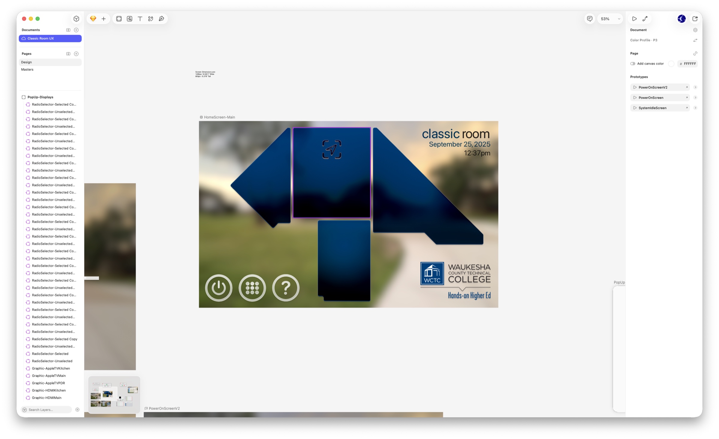
The first Home concept used a blurred room photograph, deep gradients, dimensional room-map shapes, and persistent utility buttons. It was expressive, but the visual depth competed with the controls and made repeated states harder to standardize.
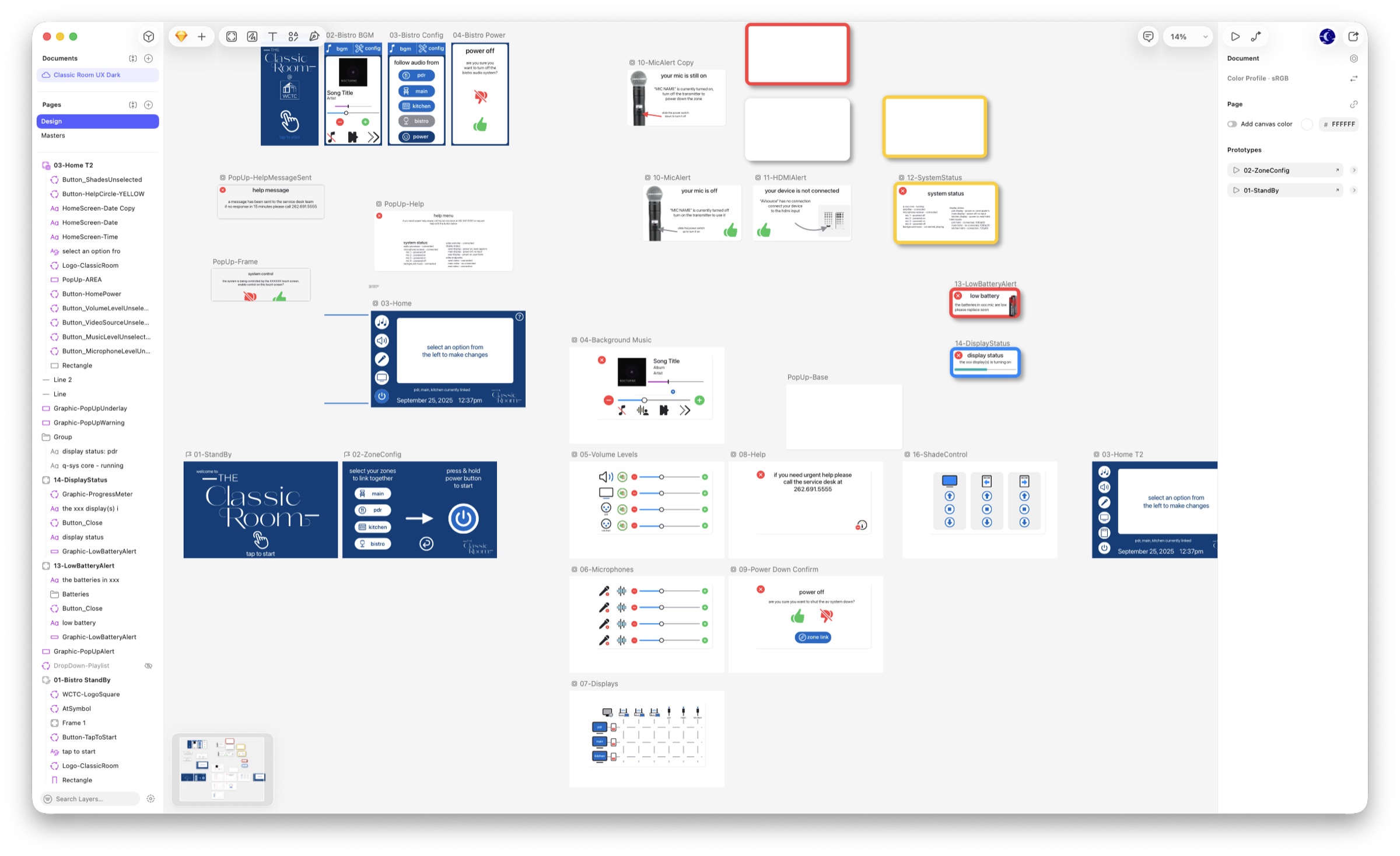
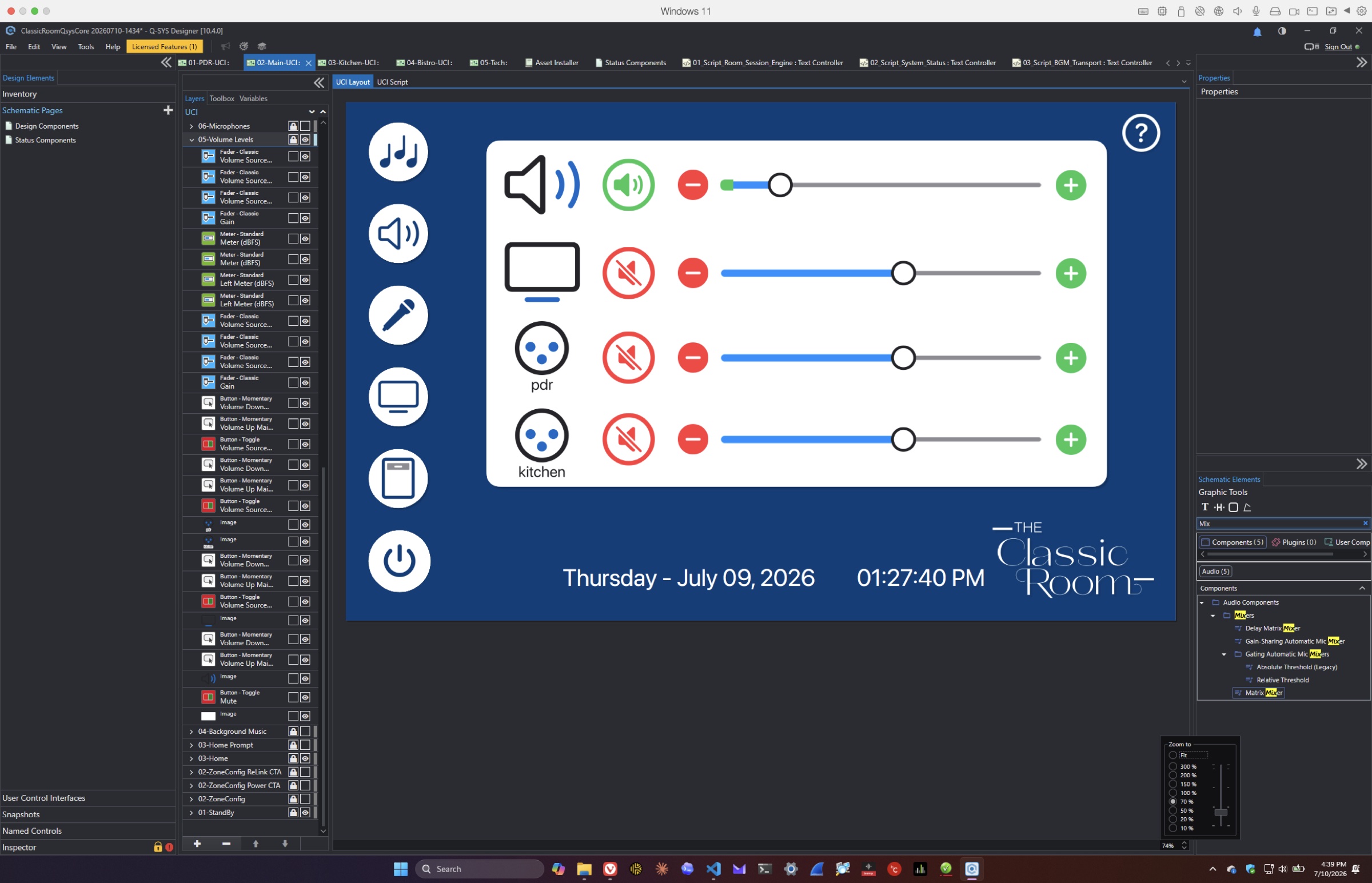
The later system moved to flat navy panels, white content areas, a consistent left rail, reusable icons, and clearer selected, unavailable, warning, and active states. The simpler surface made room linking and system feedback easier to understand at a glance.
Early conceptPhotographic, layered, and dimensional.Chosen directionFlat, repeatable, and state-focused.Implemented systemThe chosen visual language running as real Q-SYS controls.
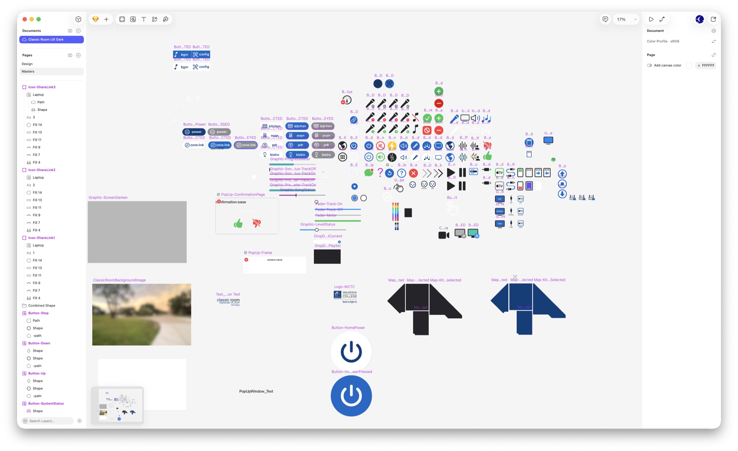
Design systemButtons, meters, icons, routing symbols, and state variations were developed as a shared visual vocabulary rather than one-off artwork.
A visible change
From fixed buttons to contextual control.
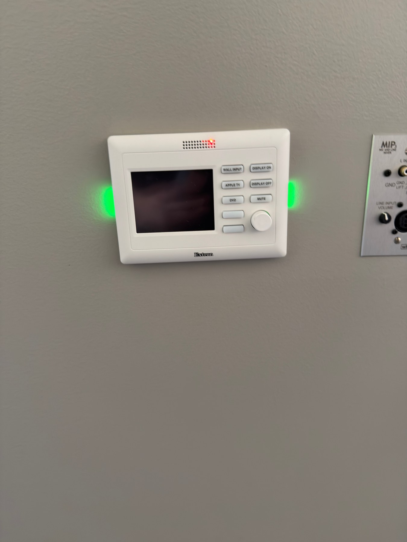
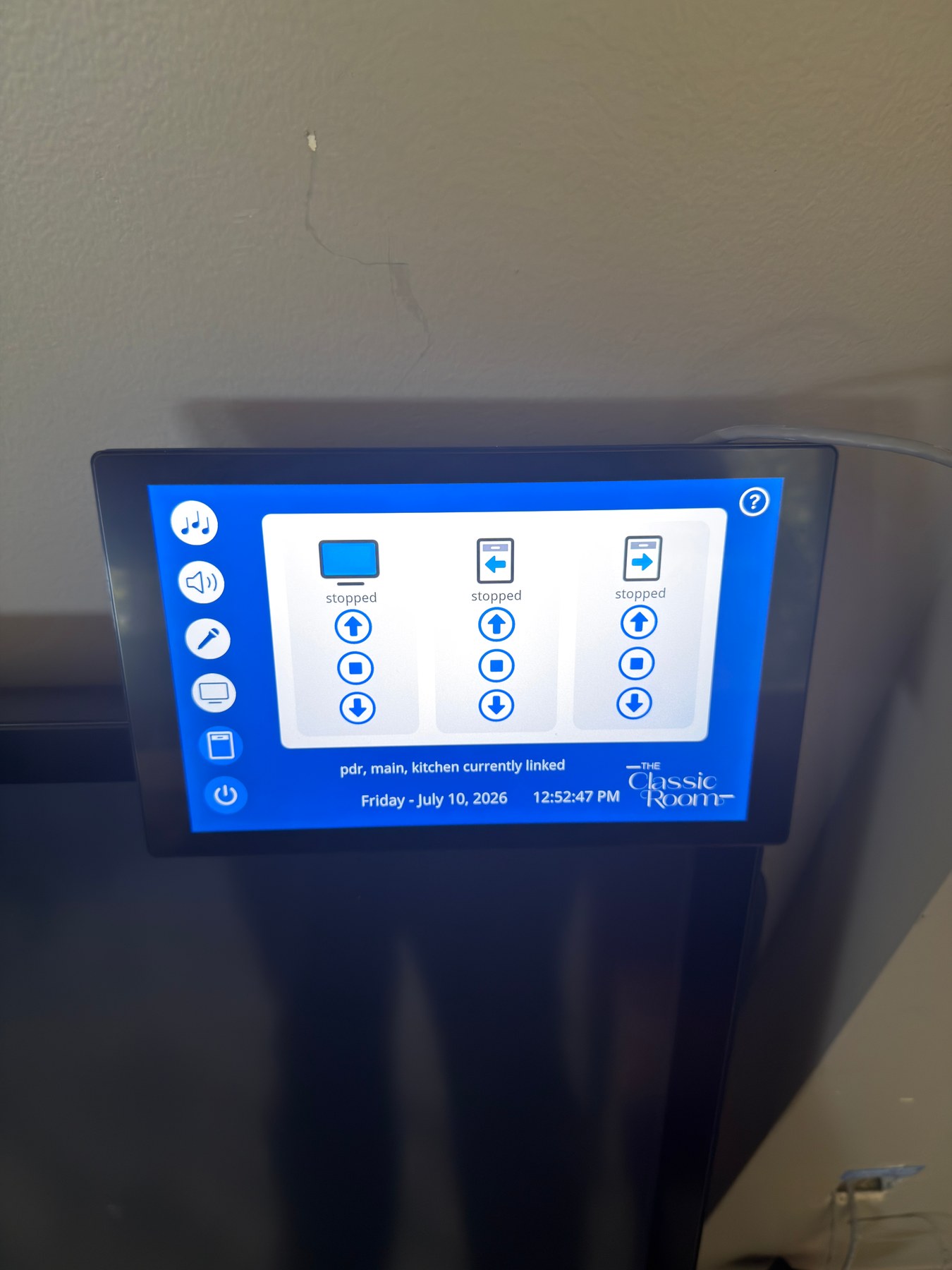
The previous controller exposed a small set of permanently labeled actions. The new touchscreen can change with the room, surface live status, coordinate linked spaces, and explain what needs attention—while keeping everyday choices visually consistent.
BeforeFixed labels and a limited display.AfterA contextual interface with room state and guided controls.
01
Recovering the real system
The project did not begin with a clean slate. Existing Q-SYS designs, Sketch documents, scripts, old conversations, mounted styles, and partially complete interface screens all held pieces of the truth. The first success was not a feature—it was building a durable shared record that made the system understandable again.
Lesson: preserve context before changing behavior.
02
Choosing a room model
The central design question was how four spaces should behave when used alone or together. The answer became a group model: users choose rooms, the system forms a session, and every shared control follows that session. This decision unified audio, displays, microphones, touch panels, and shutdown.
End-user choice: select the spaces you need, not the signal paths behind them.
03
Translating design into Q-SYS
The visual language began in Sketch but had to survive Q-SYS Designer: image export bounds, color profiles, layer naming, stateful controls, and platform limitations all mattered. Faders became a three-layer track, live meter, and cap. Repeated controls were standardized so the same gesture means the same thing everywhere.
Trial: beautiful artwork is not useful until the runtime can render and control it reliably.
04
Letting the interface say no
A flexible room creates unavailable choices: a display may belong to another group, a microphone may already be claimed, or an HDMI input may have no signal. Instead of allowing dead-end actions, the interface dims unavailable destinations and explains missing resources with specific alerts.
End-user choice: prevent confusion before it becomes a support call.
05
Debugging the invisible
Some of the hardest failures were not visual. Q-SYS local-variable limits stopped large Lua scripts. Display status sometimes arrived as strings instead of booleans. UCI assignments disappeared. Layer names differed between versions. The response was targeted diagnostics, version anchors, console events, independent audits, and saved-file verification.
Success: observability became part of the product, not an afterthought.
06
Bringing in a second AI reviewer
Several times, the active work was handed to Claude—an artificial-intelligence system that had not authored the current changes—for an independent, read-only review. Those sessions examined Lua scripts, interface instructions, CSS, wiring assumptions, saved Q-SYS designs, documentation, and project organization. Findings were returned as reports rather than silently applied, so Steve and Codex could verify each claim, reject false positives, and make only deliberate changes.
Review cycle: inspect independently, report evidence, triage findings, harden the code, then verify the saved design again.
07
What the reviews changed
The outside reviews repeatedly confirmed deployed scripts against their documented source, caught stale eight-command shade documentation after the system had moved to nine commands, identified low-risk cleanup opportunities, and prompted stronger guards around missing controls, serial feedback, shutdown behavior, and Q-SYS resource limits. Just as importantly, multiple clean reviews increased confidence that recent changes were present in the real design—not only in Markdown.
Success: a different model became a skeptical second set of eyes, not an unquestioned authority.
08
Making shutdown safe
Turning a room off sounds simple until shared audio, active displays, linked touch panels, and wireless transmitters are involved. The final sequence mutes every path, powers displays down, resets panels, preserves the right media behavior, and waits when a microphone is still physically on.
End-user choice: the system handles the complex sequence; the person only confirms intent and switches off named transmitters.
09
Designing for the installer too
Cable labels, network records, device manuals, speaker-load planning, shade serial commands, and room-by-room checklists became as important as the touch-panel screens. A solo installer needs deliberate stopping points, photos before disconnecting, and enough documentation that future work does not depend on memory.
Lesson: installation and service are user experiences too.
10
A system that can be measured
The v1.6.16–v1.6.17 work added a fifth script and a protected technician workflow for repeatable loudspeaker checks. It can select one circuit, route a safely ramped test signal, measure sound-pressure level and response, compare a runtime baseline, and propose a gain change that still requires technician approval. The system shuts normal sessions down before testing and keeps the combined Main-room target comparison-only.
End-user design decision: maintenance tools must never compromise the safety or predictability of normal room operation.
11
Following the sun
A fixed morning schedule could move a shade at the right clock time but for the wrong sky condition. The replacement calculates solar azimuth and elevation locally, compares the result with the windows’ 15° bearing, and waits five minutes before acting. Separate 70° close and 85° open thresholds prevent chatter; a sunset fallback, duplicate-command suppression, and retained manual controls keep the behavior understandable and resilient. The scheduler was then proven live when both window shades opened under the calculated solar target.
End-user design decision: automate the repetitive decision without taking away direct control.
12
Making every level visible
The sixth Lua script began as an isolated background-music meter proof, then expanded to proportional volume and microphone meters. Exact Root Mean Square (RMS)—a useful measure of audio signal level—control names were checked against the saved design so the visual feedback follows real signal state instead of an assumption.
Lesson: a convincing meter must be tied to measured truth.
13
A living system
By v1.6.28 the project had become more than a Q-SYS file: it was a versioned body of six scripts, interface instructions, user guidance, device references, audits, 386 snapshots, and 300 handoff entries. The latest cycle also added Reflect health monitoring, corrected network-video routing, and hardened display startup. Open physical-commissioning boundaries remain part of the story, not details to hide.
The story continues through measured evidence in the room.
What endured
Clarity over cleverness. Feedback over guessing. Documentation over memory.